Monday 27 February 2012

Evaluation


Colour Scheme


We chose to challenge the conventions of horror and stay away from the colour red, as our horror trailer was more about technology and riots rather then murders.We chose the colour Green as it reltes to technology slightly more then any other colour, it gives it that technical feel.


Audience Feedback


Our Horror Trailer


This is the final edit of our trailer we have presented to our audience.

Thursday 23 February 2012

Marketing


At a bus stop


Posters whilst driving

Trailer Feedback

After uploading our trailer on youtube, we got some positive comments by a few people:


YouTube also allowed us to see where
about our traile
r was being viewed the most:

One of the negative reviews we have been hearing from almost everyone is they do not know who is coming, this could be negative as our audience are confused, but I believe it could also be seen as a positive remark as trailers are not suppose to tell you what happens in the film, they are there as a teaser to make you want to watch the film to understand what is going on. Our trailer does just that, although our audience are slightly confused they are still intrigued and want to know who is coming as that is one of the first questions they ask after watching our trailer. I was very pleased with the feedback and expected this result.

Tuesday 21 February 2012

Technologies


Throughout this experience I have learnt how to use new programmes and improved my skills in certain programmes. I have used many different new technologies and many different programmes. at the start I was very hesitant to use many of these programmes but as time went on I was able to adjust to them and did quite enjoy it at the end.


Sunday 19 February 2012

Magazine front cover


We chose to you Empire as our film magazine cover, we chose to stick to the conventions of a magazine and chose to stick to three colours throughout the cover which are Green, black and white. We wanted to use alot of green and when researching the magazine realised the only time the magazine changes its usually red colour scheme is when it is a special edition magazine and so we chose to change the entire colour scheme from red to green so it shows consistency through all of our work.
We stuck to the average pull out quote and the features and things inside the magazine shown at the front of the magazine, just as usual magazines would do.
We chose not to add a button on our magazine as our anarchy sign seemed big enough and was making a big enough impact and so we didn't think we needed one.


This was the Empire magazine that inspired us with our magazine cover, we have the same colour scheme and the same style picture. We chose to take a different type of photo a close angle shot, we did try high angle shots and also low angle shots but the best shot seemed to be the straight angle shot, but the magazine on the left was were we got the idea. We didn't want to use the same side view shot as we did in our poster we wanted show our wide range of different techniques and the choices we had been taught.

The way Vendetta has a giant 'V' in the centre of the magazine cover, we chose to use our trademark anarchy sign in the centre of ours, to make our magazine stand out and attract attention, our target audience is teens and so this sign will catch their eye and make them want to read the magazine. Also we have this sign present in our trailer and so it shows a sense of consistency.

Film Poster :)


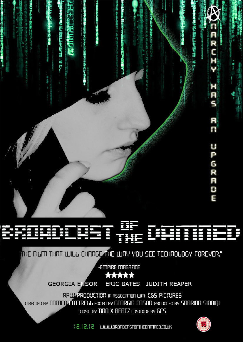
We were rather impressed with out magazine poster, it turned out just as we imagined, with a few minor changes, the main problem we had when trying to complete our poster was the reading ability of the writing.
As the picture was contrasted our models hand seemed extra light and so the white writing appeared to be unreadable and so we changed the writing so that some of the words were black and readable and the rest on the black background remained white.
We managed to stick to our colour scheme and used our idea of the matrix theme at the top of our page just
the way we wanted it.
Our inspiration for this poster was infact the matrix theme,


We also used the strap line style, the way it has been used in the matrix, and we used the colour green as our story is based on technology and social networking and the youths and the colour green seemed to go in perfectly with the whole theme.

Overall the concept was well thought out and the end result matched the idea in the start.


We used the idea for our title from the poster of 'Diary of the dead' We used the same concept, the way they have written 'of the'. We really did like the idea and so this was the poster that inspired us with our title layout.

Trailer

Costumes for the trailer


Above is a presentation of the clothes we told our actor to wear when we filmed for the trailer, and reasons why we chose the costumes that we chose.

Pictures

In this slideshow there are a few pictures of how we editing and whilst we were filming our horror trailer. We did come across many different problems, such as the weather whilst we were filming but we made it work to our advantage, for example, the cold windy weather helped make our trailer look slightly more gloomy and scary.
We also had a few problems when editing as it was a new programme and we were not too sure how to use it, but once we figured out the special affects available we used these to our advantage also, for example when it was sunny outside and it did not help our shot as it looked like a bright sunny day which seemed happy, we were able to change the brightness on the editing programme which helped us with many of our shots.


Thursday 5 January 2012

Poster Analysis

Research

In order to get the right narrative we were told to do some research into our target audience where we would find out what age group like what sort of films, this would help us with our narrative.

In order to do this I set up a few questions and asked a load of people who helped me contribute ideas when we got into our groups, I was able to do this using Survey Monkey.


The type of questions I asked where:

Burning to DVD

we chose the news footage we wanted to use in our trailer, and we wanted it to be able to play on a television. In order to do this we had to burn the footage we found on youtube on to a dvd so that it would be able to play on a DVD player on tv.


This is the video link we found on you tube that we burnt onto the dvd:


We are going to use the first 13 secs of this video in our trailer.